
Unified Integrated Platform
Research
The project focused on enhancing Amazon Prime Video by integrating a unified platform that aggregates content from Hulu and Netflix. Initially, I assumed users would value social interaction features like live chats during shows. However, research revealed that users were more concerned with managing multiple subscriptions and navigating fragmented content, leading to a pivot toward solving these core pain points.
To define the problem, I conducted remote interviews with avid streamers, exploring their content discovery habits, frustrations, and desired features. Key insights included: Frustration with switching between platforms and managing separate watchlists, Strong demand for a unified search feature aggregating content from all services, and Interest in personalized recommendations considering viewing history across platforms.
One user highlighted the annoyance of forgetting which platform a show was on, while others expressed the need for seamless transitions and unified watchlists. Competitive analysis reinforced these findings, identifying market gaps in cross-platform functionality and user interface design.
With 80% of users expressing interest in a unified solution and 75% frequently switching platforms during a single session, the design centered on reducing fragmentation, streamlining content discovery, and enhancing the overall streaming experience.
Define
Problem Synthesis and Ideation
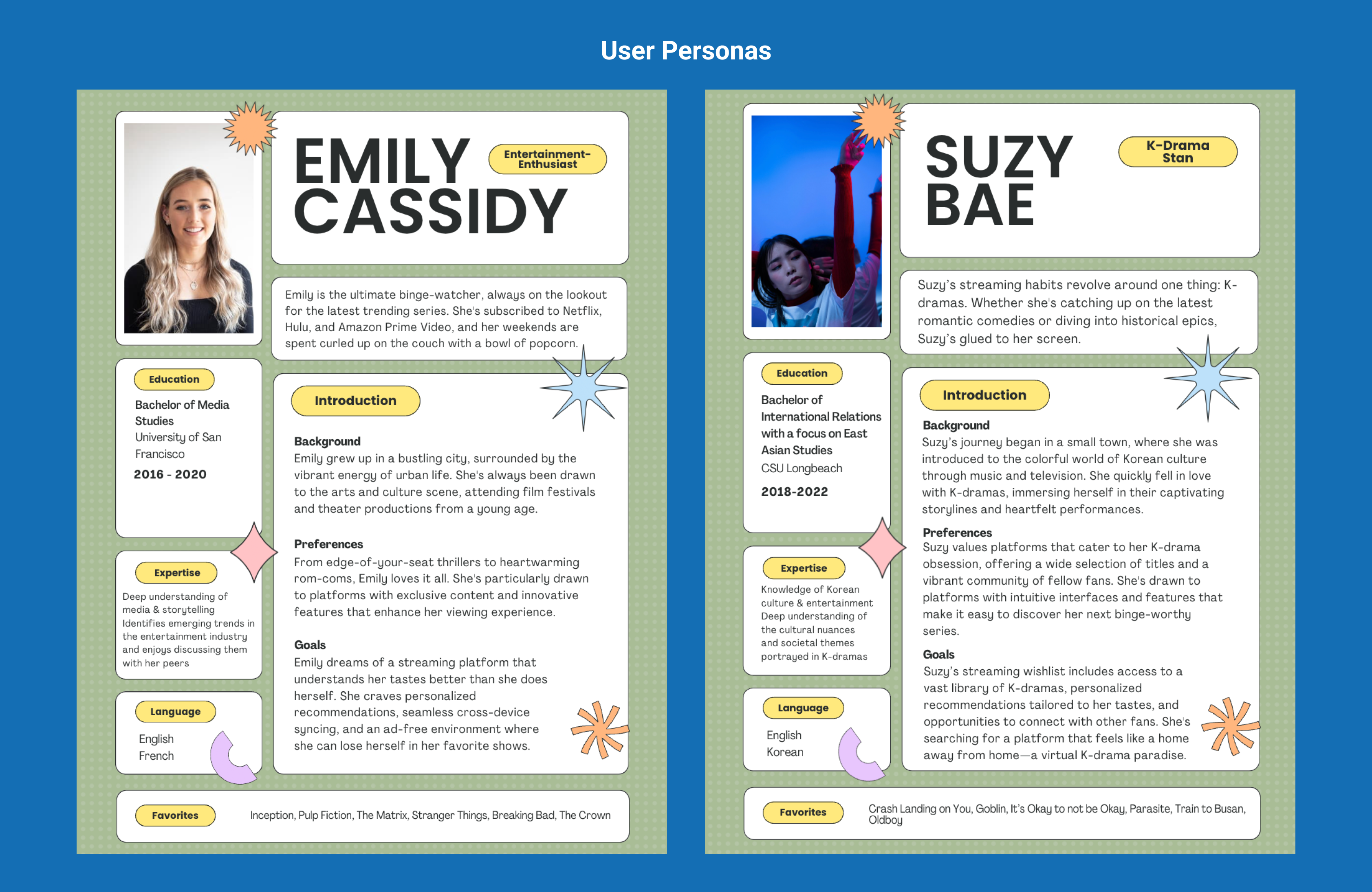
Through research synthesis, the core issue was identified: the fragmentation of content across multiple streaming platforms disrupts the viewing experience for avid streamers. Two primary user personas emerged from the research. The Binge-Watcher is a daily content consumer who subscribes to multiple services, while The Discoverer actively seeks new content and values personalized recommendations. These personas guided the design process and helped ensure the platform catered to varied user needs.
User Journey Mapping
Mapping typical user journeys revealed critical friction points, such as navigating between platforms and managing separate watchlists. These pain points often resulted in a disjointed and time-consuming experience. Identifying these challenges provided a foundation for designing solutions that addressed the most significant obstacles in the streaming process.
Ideation and Iteration
Early sketches explored ideas like unified content feeds, advanced search, and streamlined watchlists. These evolved into wireframes and interactive prototypes tested with users to refine functionality. Continuous user testing ensured the final design addressed key frustrations, delivering a cohesive platform that simplified content access and enhanced the streaming experience.
Design
The design process for the Unified Integrated Platform centered on creating a cohesive, user-friendly experience that merged the content from Hulu, Netflix, and Amazon Prime Video into a single, seamless interface. The primary objective was to ensure that the platform felt like a natural extension of Amazon Prime Video while maintaining its own unique identity. This required a meticulous, user-centered approach that emphasized iterative design, continuous feedback, and strategic problem-solving.
The process began with ideation and sketching sessions aimed at conceptualizing how the platform would integrate multiple services without overwhelming the user. Early sketches explored various layouts and navigation structures, focusing on simplifying the user experience. The challenge here was to avoid the platform becoming cluttered, given the vast amount of content being aggregated. I resolved this by prioritizing essential user tasks, such as content discovery and seamless navigation, ensuring a streamlined initial concept.
Next, I developed low-fidelity wireframes to map out the core user flows, including onboarding, browsing, and switching between content sources. These wireframes were essential in visualizing the platform’s structure and were tested with a small group of users to validate the design’s direction. One of the early challenges was ensuring that the transition between the different streaming services felt natural and intuitive. User feedback indicated confusion regarding where content was sourced from, which led to the integration of subtle visual cues, like service-specific icons, to guide users seamlessly.
The wireframes evolved into interactive prototypes created using Figma, which allowed for dynamic testing of user interactions. During this phase, usability testing was conducted both remotely and in-person. Participants were tasked with actions such as finding a show, switching between services, and managing their watchlist.
With validated wireframes, I moved on to high-fidelity designs, which incorporated the visual identity of Amazon Prime Video while introducing a complementary color palette of blues, grays, and whites. Blue was chosen to evoke trust and technology, while neutral tones provided a clean backdrop, allowing the vibrant content thumbnails to take center stage. Balancing the established branding with a fresh, unified look was a key challenge. I resolved this by maintaining consistency in typography and spacing while introducing new visual elements that subtly distinguished the platform.
One of the most significant challenges was ensuring the platform’s performance and visual consistency across various devices. Early testing revealed that the interface didn’t scale well on smaller screens, which led to adjustments in the responsive design. Another challenge was ensuring that content discovery remained effortless despite the integration of three major streaming services. This was addressed by implementing a powerful, unified search feature and personalized recommendations that spanned all services, providing users with a seamless content discovery experience.
The challenge of unifying three distinct platforms into a cohesive experience was creatively fulfilling and rewarding, resulting in a product that not only met user needs but also enhanced the overall streaming experience. Through this meticulous, iterative design process, the Unified Integrated Platform was developed to provide users with a streamlined, enjoyable, and efficient way to access their favorite content across multiple services, setting a new standard in the streaming industry.


Test
Usability testing was an essential part of refining the Unified Integrated Platform, ensuring the final product delivered a seamless and satisfying user experience. This phase involved rigorous evaluation across multiple stages, from initial wireframes to fully interactive prototypes, each step focused on uncovering and addressing potential usability issues.
Testing began with low-fidelity wireframes to assess the basic structure, user flow, and navigation. Participants were tasked with core actions such as signing in, browsing content, and picking a title to watch. A significant challenge emerged during these tests: users struggled to understand how to navigate between the different content providers within the unified interface.
Resolution: To address this, I introduced a consistent navigation bar that clearly indicated the current content source while allowing easy switching between platforms. Visual feedback, such as subtle animations and highlighted sections, was added to ensure users always knew where they were within the platform.
Visual Design Testing:
With feedback from the wireframe stage incorporated, I moved on to testing the high-fidelity designs. This phase focused on the platform’s visual appeal, branding alignment, and overall aesthetic. Testing involved evaluating how well the visual design elements supported usability, especially regarding content discovery and differentiation between platforms.
Challenges and Solutions:
- Content Source Identification: A challenge was the need for a visual system that allowed users to quickly identify which streaming service each piece of content belonged to without overwhelming the design with logos. Users felt that the original design, which displayed logos prominently next to each content item, cluttered the interface and detracted from the viewing experience.
- Solution: I implemented a system of color-coded dots representing each service—blue for Amazon Prime Video, green for Hulu, and red for Netflix. These dots were subtly placed next to content titles, offering a clean and unobtrusive way for users to identify content sources at a glance. This solution preserved the platform’s visual integrity while maintaining clarity.
Testing Fully Interactive Prototypes:
The final stage involved testing fully interactive prototypes built in Figma, which simulated the complete user experience. Participants were asked to perform tasks such as searching for specific shows, managing their watchlists, and switching between streaming services. This phase was critical in ensuring that all elements of the platform worked together harmoniously.
Key Findings and Adjustments:
- Search Functionality: Users initially found the search experience cumbersome, particularly when switching between content libraries. Feedback indicated the need for a more integrated search experience that provided results across all services in a unified list.
- Solution: I redesigned the search function to deliver aggregated results with filter options, allowing users to refine their search by service, genre, or content type. This enhancement made the search process more efficient and user-friendly.
The iterative usability testing process for the Unified Integrated Platform was instrumental in shaping a product that was not only visually cohesive but also intuitive and aligned with user expectations. Each round of testing provided valuable insights that led to meaningful design refinements, ensuring that the final platform offered a seamless, enjoyable user experience that bridged the gap between multiple streaming services.
.png)